Lorem ipsum dolor sit amet, consectetur adipiscing elit, sed do eiusmod tempor incididunt ut labore et dolore magna aliqua. Ut enim ad minim veniam, quis nostrud exercitation ullamco laboris nisi ut aliquip ex ea commodo consequat. Duis aute irure dolor in reprehenderit in voluptate velit esse cillum dolore eu fugiat nulla pariatur.
Example: A business wants to redesign its e-commerce website. By analyzing user data, they discover that a significant number of users abandon the checkout process on a specific page. With this insight, the design team decides to simplify the checkout process by reducing the number of form fields, resulting in increased conversions and improved user experience.
The apparel industry is all about aesthetics, and as such, your website must meet a certain design standard in order to help site visitors convert into customers. This is where the right UI (User Interface) becomes crucial.
To give you simple and tangible action items to incorporate (or upgrade) in your site, let’s focus on 3 key design components that help optimize the success of apparel company websites.
1. Photo Selection is King (or Queen)
When we’re talking fashion, it’s all about the product itself. You need to be showing-off your trendy threads front and center which means:
A) The quality of your images (or videos) need to be top-notch B) The clothes need to be where visitors’ eyes gravitate towards C) In most cases, you’re going to want humans wearing the products
A and B above are probably obvious, but C also matters, and here’s why.
When a visitor is considering making a purchase, by seeing a human wearing your clothes, it is subliminally easier for their mind to entertain the idea of them being the one who might be wearing that same item. It’s almost like inviting someone’s subconscious mind to mentally try on the item for themselves.
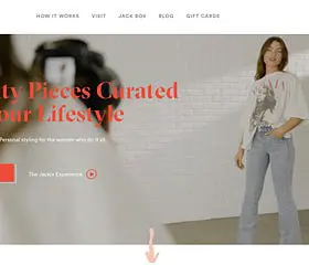
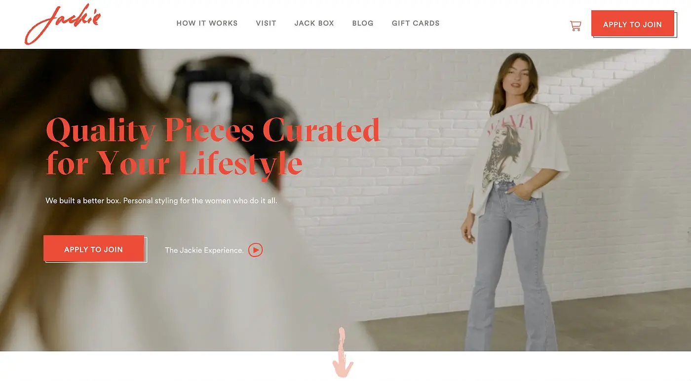
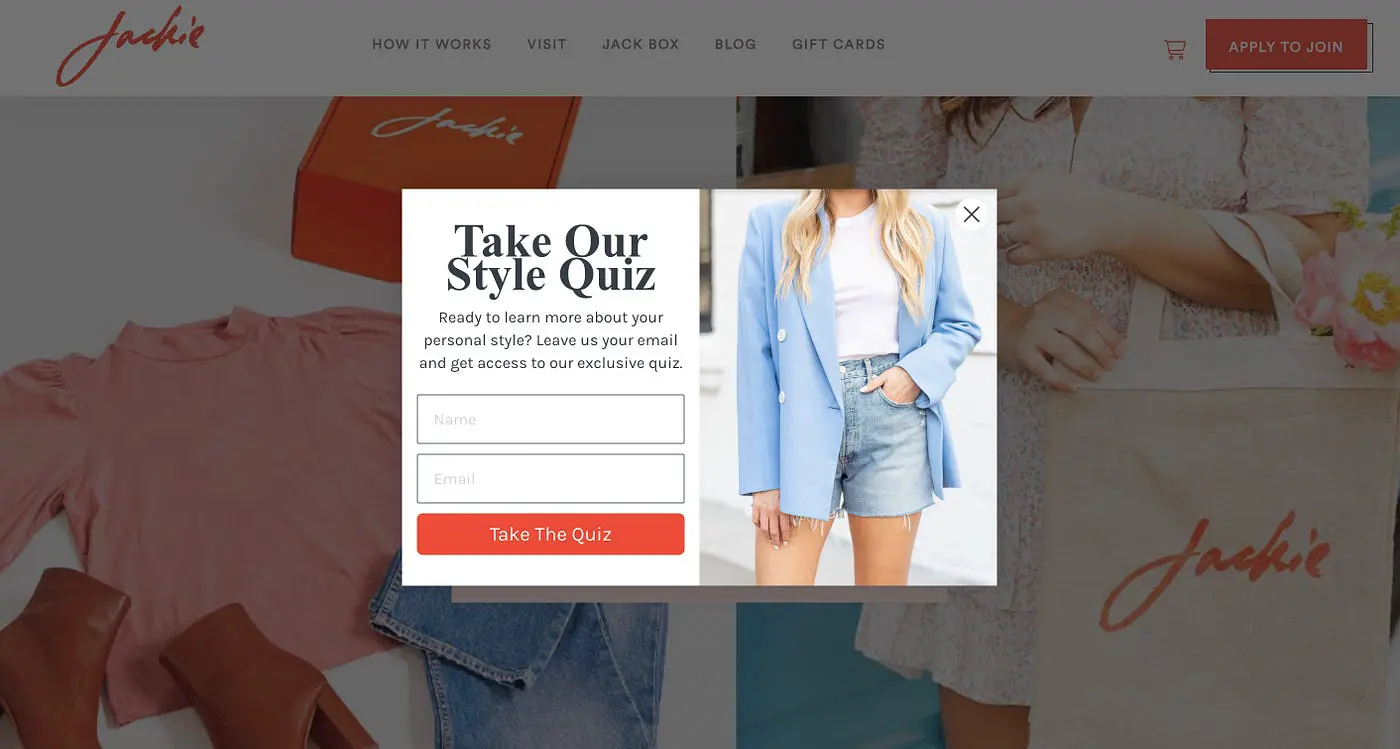
Let’s take the brand Jackie for example, which is a subscription box featuring women’s clothing that blends function, form, and fashion.
Jackie uses a hero video, rather than a still photo, but still incorporates the use of quality imagery where visitors can get a clear vision of various clothing styles the company offers, and can see several different women modeling the clothes.
Despite Jackie being a subscription box, they didn’t stick with simply a photo of their box as the first thing that visitors would see. Why? Because the copy itself already says who and what the company is, but it’s seeing the apparel itself that will help a visitor be intrigued as to how these items might fit into their own wardrobe and lifestyle.
2. Your Fans = Your Secret Weapon
Speaking of making things human- don’t be afraid to put focus on the real humans who your brand speaks to.
When someone has never made a purchase with you before, odds are you’re going to need to build trust with them before they’re willing to pull out their credit card.
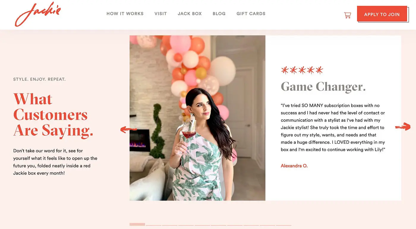
A fantastic way to do this is with reviews, and again, focus on the human element. If you have happy customers who are willing to let you use their photo on your website, utilize that!
Simply having a review is fine, but when there’s a photo of who the review is coming from, that review now feels real. Better yet, if customers submit a photo of themselves while wearing your product, now you’re really able to help build credibility with potential customers.
Make sure to keep the look and feel of your client testimonials consistent with the rest of your branding. Jackie incorporates the brand colors, logo, and feel or the brand effortlessly with their website’s testimony section.
Another really key takeaway from what Jackie’s testimony section does, is it focuses on how their product makes customers feel, rather than just on the look of the product.
Potential shoppers are able to see what your clothes look like by your imagery, but client testimonies give them the ability to image what the experience of wearing your product is like. This allows them to connect with your brand on an emotional level, which is often an overlooked element many clothing brands don’t tap into.
3. Capture Emails Now, and Their Hearts Later
Odds are a visitor isn’t going to be ready to make a purchase on their first visit to your website. (Unless you’re one of the lucky brands to have a trending product that unexpectedly went viral all over TikTok, which if so, congrats!) But assuming that isn’t the case…
Just because a visitor isn’t ready to make a purchase right away, that doesn’t mean they wouldn’t be interested down the line. Don’t let a potential customer be (yet another) one that got away!
By capturing someone’s email address, you now have the ability to market to that visitor, and perhaps in time, even win their heart over.
Many brands do this by offering a discount to their site that is sent over by email, but Jackie takes the approach of adding value to capture visitors’ email addresses.
As shown above, Jackie has an exclusive Style Quiz that provides value to visitors once they type in their email address. This is an easy yet impactful way to grow an email marketing list, because when a potential customer feels like they got value from you, it helps increase their positive feelings towards your brand as a whole, which helps influence their purchasing decision.
As a bonus, Jackie also offers $10 off your first Jackie Box when you sign up for their newsletter in their site’s footer, giving a second opportunity to get on their email list. Smart.
Need a Website Refresh?
We are Brave People. We help our client partners look ahead to what doesn’t yet exist by bringing their digital products to life and driving shared value for everyone involved.
If you haven’t already guessed it, Jackie is one of the many client partners we have had the joy of collaborating with.
Interested in chatting with us? Feel free to reach out here.